Role
Product design
Year
2015-2016
After testing out "Uber Fresh" as a concept to select markets where pre-made meals were put into cars and requested from the Uber app, we quickly learned that people wanted selection.

Providing choice proved to be beneficial to the company, but with more choice comes the paradox of choice. We first launched with about 100 restaurants in Toronto, but we had to prepare for the situation where we would have 1000's of restaurants and how we would design for that to provide our users with the food they want.


The challenge of knowing what a person might feel like eating when they open up the app is a very difficult task. We went with a carousel design to be able to group categories while saving vertical space in the list. This would allow local markets to customize their offerings to their cities needs, but also have a consistent system that the user can understand.

Categories to inspire users (version not implemented).
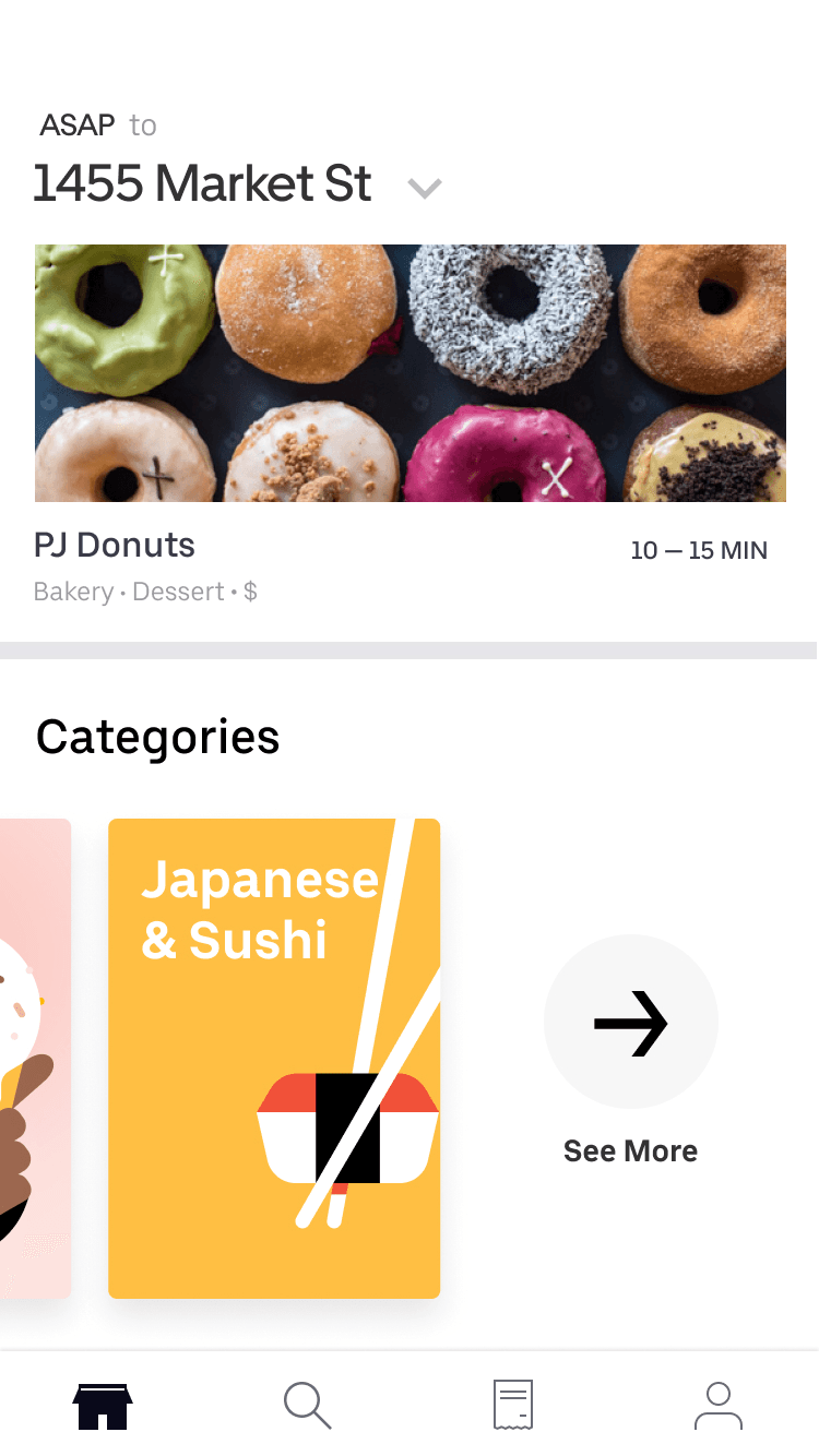
Allow users to view all categories. We use machine learning to surface relevant categories based on history.

Framer prototype for filtering concept that allows users to find what they want.
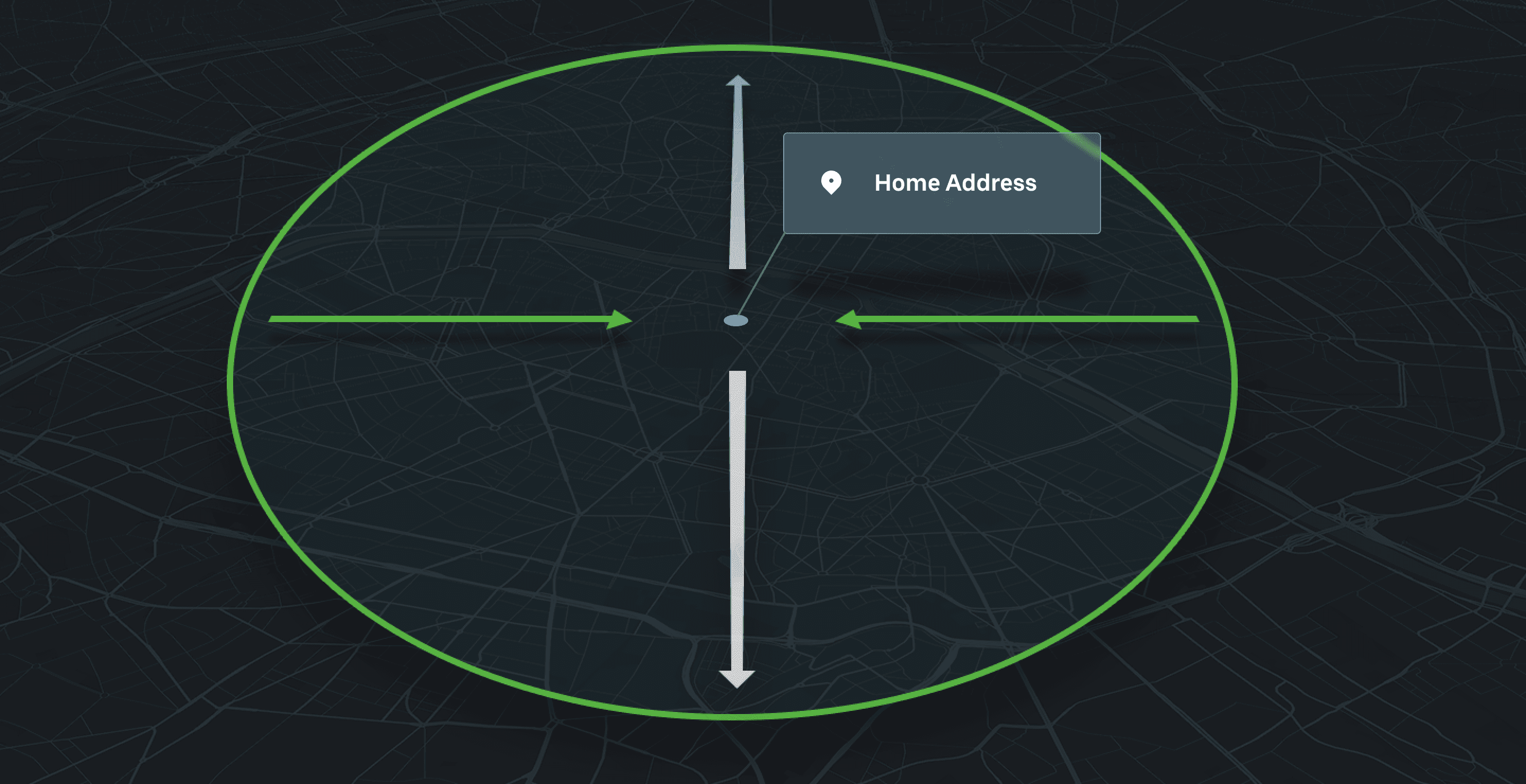


Ultimately, we learned that address entry cannot be a one-size-fits-all experience. To account for these global and logistical nuances, we designed a highly flexible location framework. This adaptable system dynamically scales to capture diverse regional data, ensuring a frictionless delivery and handoff experience for both Eaters and Couriers.
Menu curation is powerful. More subsections viewed = more options = higher conversion. Our goal was to help eaters decide what to order from a menu and make it easier to explore a restaurant's menu. In v1 of the menu design we had a structure where the categories were in a accordian format, and quickly learned that we should remove the extra tap that the accordian menu caused the user to make.

33%
Of all sessions where a user opens a menu results in request.
2/10
Of people who view "Most Popular" are more likely to place an order.
38%
Increase conversion rate from Restaurant view to order.
In order to keep continuity between the home feed of restaurants to the restaurant menu page, we used the restaurant photography as the hero image in the menu screen. We displayed most popular dishes up top to give the user a sense of what is ordered most often. Through machine learning, we created categories such as recommended for you, which was based on the user's past orders and likelyhood that the user would enjoy that particular dish.


In the first version of the order delivery screen, we were not able to incorporate a lot of features we would have liked, e.g.(live car and map, progress indicator, and clear communication of status of the order). In the second version, we took the approach of keeping the familiarity of the Uber Rides app while adding features unique to an Eats experience. We wanted to be as transparent as possible for the order and communicate the status, set expectations for the user, and hypothetically lower the amount of inbound support tickets due to "late orders".

Motion study of transition for checkout screen to order status.

Motion study of transition between preparing order to courier en route.

Motion study notification from courier.