Product Designer
Mas Tsujimoto, Peter Ng
2015
Product Designer
Mas Tsujimoto, Peter Ng
2015
While working on the rider team, Apple came to Uber with the opportunity to build an app for their first-generation Apple watch. This was an exciting opportunity since we would be able to design for an experience that has never been done before and be the first ride-hailing platform to be featured in the Apple keynote which proved to be a perfect pair.
While working on the rider team, Apple came to Uber with the opportunity to build an app for their first generation Apple watch. This was an exciting opportunity since we would be able to design for an experience that has never been done before and be the first ride hailing platform to be featured on the watch which proved to be a perfect pair.
Fitting Uber into a watch
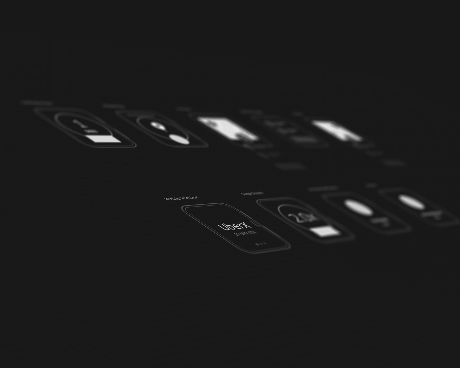
With a tight timeline, we had the task of fitting the Ride experience into a watch, which has never been done before  . The form factor of the watch wasn't known and only had rough ideas of the size which we would base our designs on. The capabilities of what we would have was also unknown, which led to a lot of shooting in the dark but also allowed us to think big in a small form factor.
We were invited to Cupertino to work on the designs where we were shown the watch, but could not actually touch it. The limitations that we had with the watch pushed us to think harder about what the experience would be in a simplified watch form.
We initially took the whole flow of the rider app and wanted to see how it would feel in a watch interaction pattern and immediately saw that the amount of steps felt a bit too overloaded for the watch. We then started to pair down the flow in order to utilize the wrist experience.
Fitting Uber into a watch
With a tight timeline we had the task of fitting the Ride experience into a watch (which has never been done before :-0 ) was definitely a challenging task. The form factor of the watch wasn't known and only had rough ideas of the size which we would base our designs on. The capabilities of what we would have was also unknown which led to a lot of shooting in the dark, but also allowed us to think big in a small form factor.
We were invited to Cupertino to work on the designs where we were shown the watch, but could not actually touch it. The limitations that we had with the watch pushed us to think harder about what the experience would be in a simplified watch form.
We initially took the whole flow of the rider app and wanted to see how it would feel in a watch interaction pattern and immediately saw that the amount of steps felt a bit too overloaded for the watch. We then started to pair down the flow in order to utilize the wrist experience.
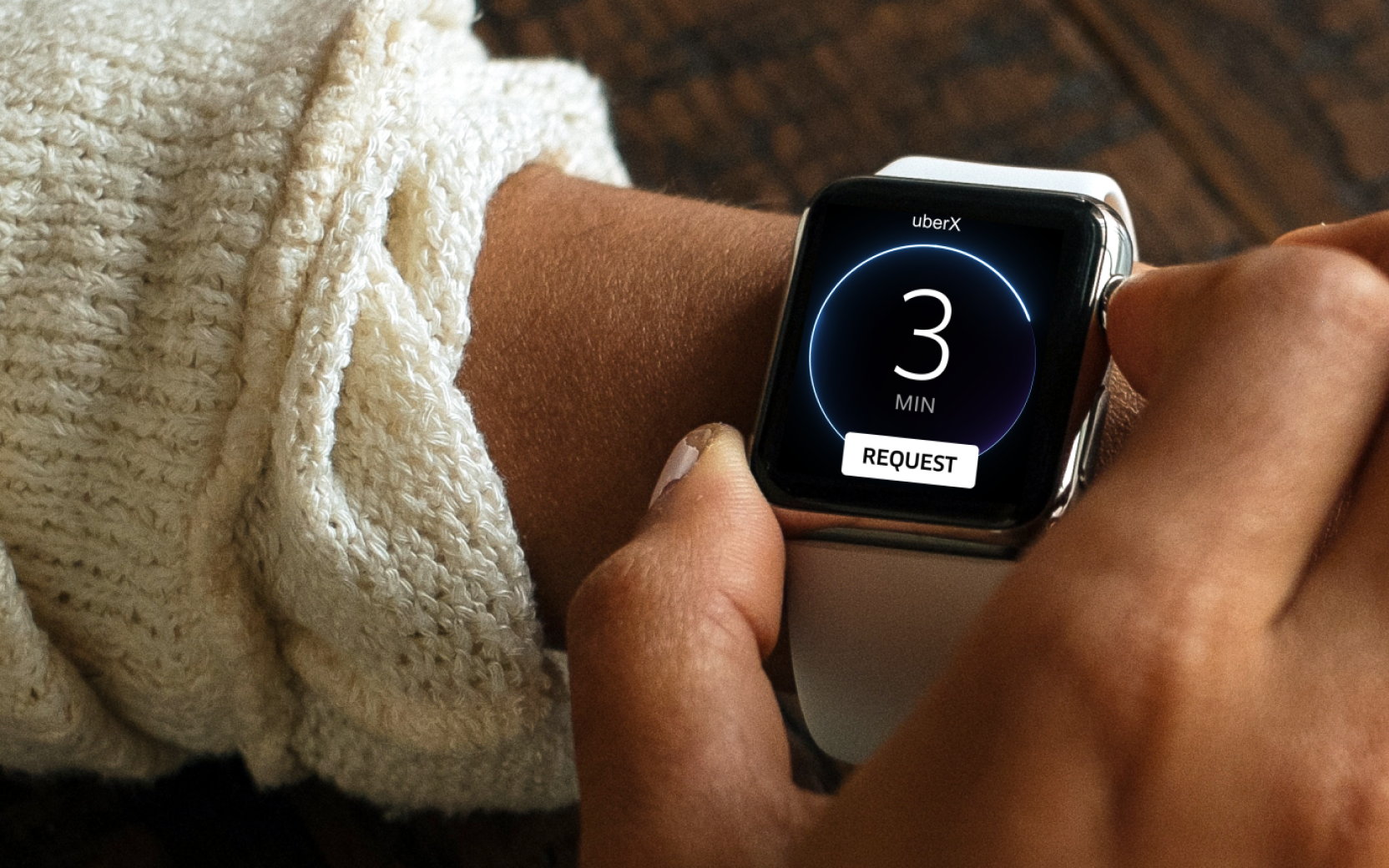
We wanted to design a simple interaction that made the user feel like Knightrider by giving them the power to get a ride with a tap.
We wanted to design a simple interaction that made the user feel like Knightrider where they had the power to get a ride with just a tap.
The Tap
We kept the amount of info per screen very simple as not to cause cognitive overload for the user, especially on this small form factor. We kept the last used vehicle as through studies we learned that users generally stick with a vehicle selection and was rarely likely to keep switching vehicle types, the ETA front and center and then the request button.
One Tap
We kept the amount of info per screen very simple as not to cause cognitive overload for the user especially on this small form factor. We kept the last used vehicle as through studies we learned that users generally stick with a vehicle selection and was rarely likely to keep switching vehicle types, the ETA front and center and then the request button.
Looking for your ride
This experience needed to feel live and smooth with the transition to the following screen. We relied on the GPS location of the users phone to get the location of the user as the first generation Apple Watch did not have GPS capabilities to utilize.
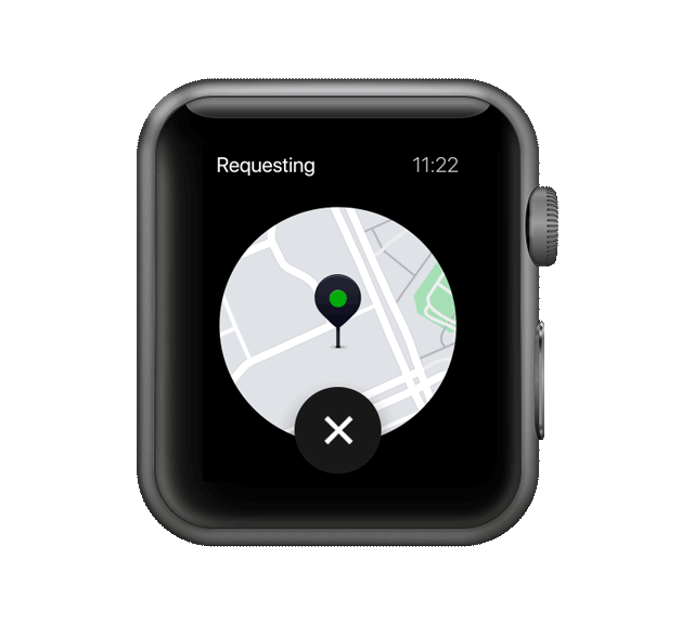
Requesting
For the requesting screen we took the approach of showing the map pin of where you are and the a requesting loader. (We originally were thinking of having a shortcut to where you want to go before this screen, but did not have that feature ready in time).
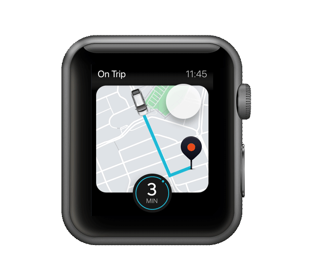
When and where you are
We wanted to give the user the same comfort of knowing that the driver partner is on their way and show the ETA while giving all the relevant vehicle information. This screen allowed the user to quickly glance the status of their trip.
When and where you are
We wanted to give the user the same comfort of knowing that the driver partner is on their way and show the ETA, while giving all the relevant vehicle information. This screen allowed the user to quickly glance the status of their trip and ETA.
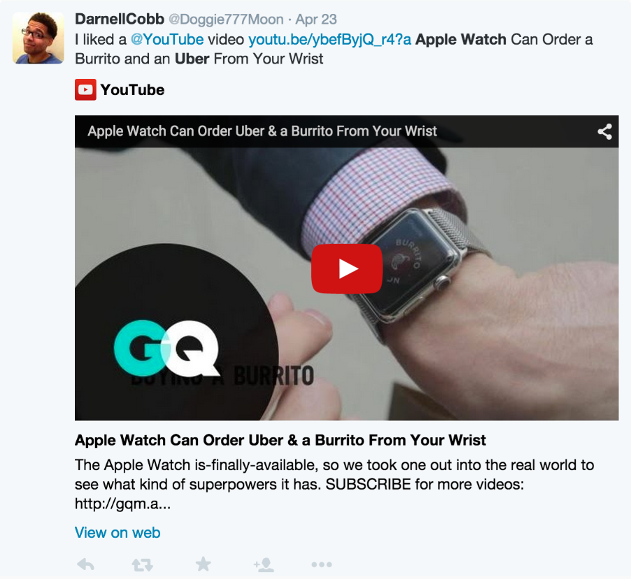
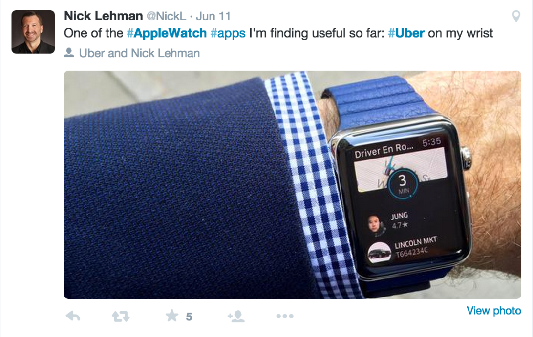
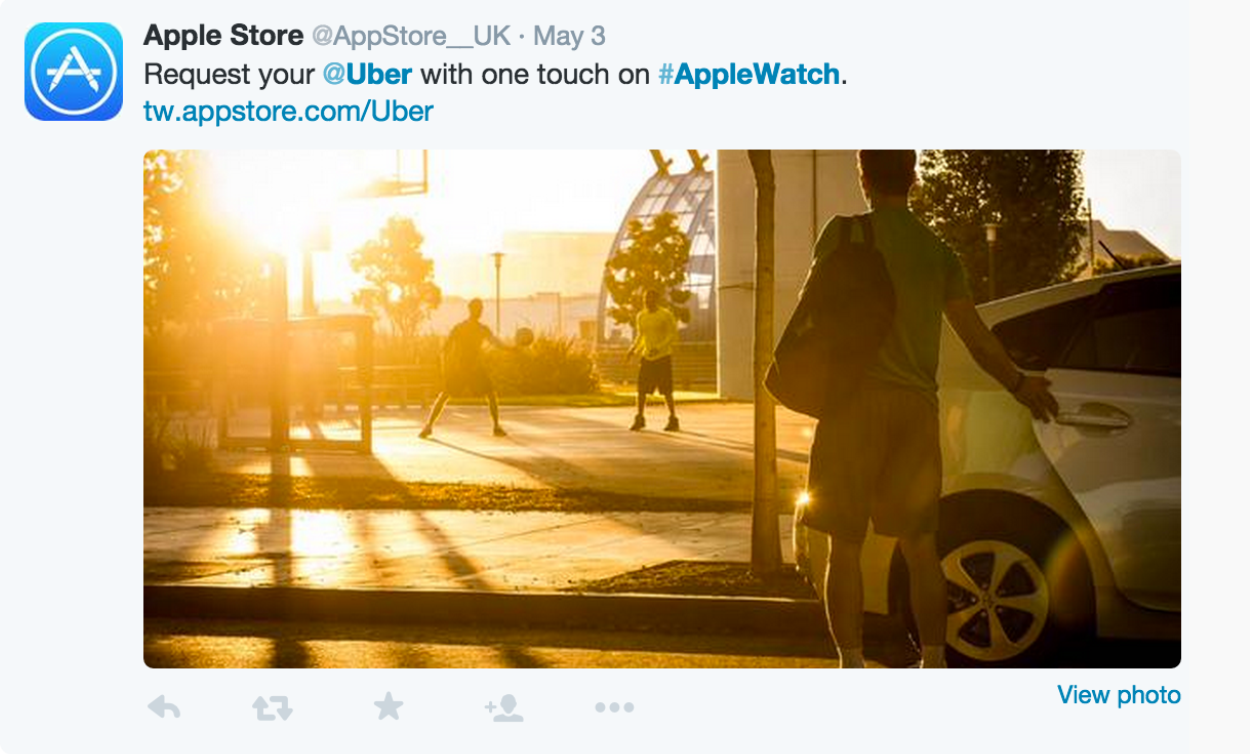
Feeling the ![]()
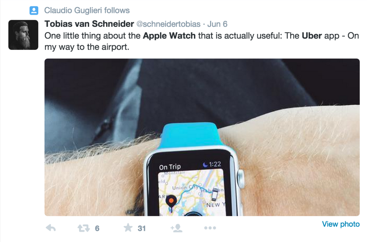
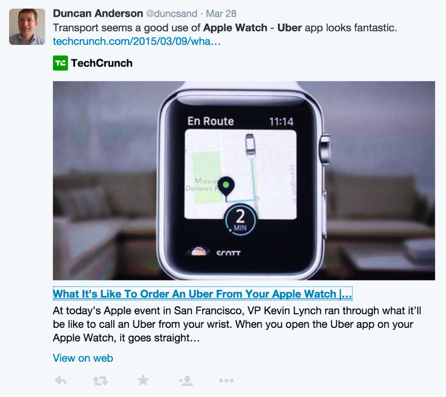
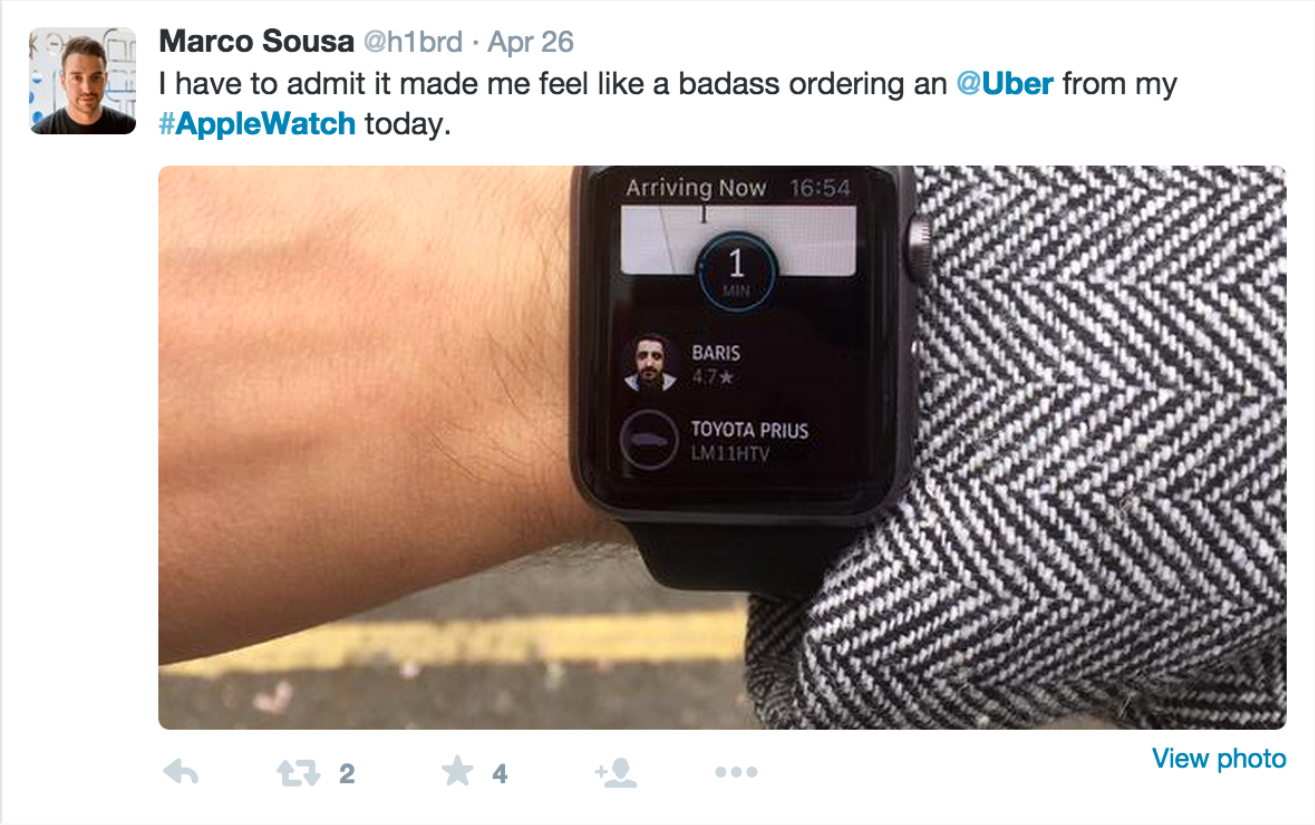
After launching the Apple Watch app, we saw an overwhelming positive review from people on twitter and news articles. It was great to see that the work we did to break down the Uber experience into a watch experience paid off.
Feeling the ![]()
After launching the Apple Watch app, we saw an overwhelming positive review from people on twitter and news articles. It was great to see that the work we did to break down the Uber experience into a watch experience paid off.
Want to chat?
mas21t@gmail.com